AN INVITATION EVOLUTION
In the digital age, I am still a believer in thoughtful, carefully crafted invitations. It shows guests a level of attentiveness and advance planning is going into the party that a digital invite may not convey. For us, real invites have meant two things: turnout and retention. First time guests are usually intrigued by an actual invitation; it stands out in a sea of notifications. For repeat guests, autumn has become a time of anticipation; friends expectantly wait on the arrival of a mysterious looking envelope or parcel.
Physical invitations do require a good bit of advance planning-designing, creating, gathering addresses. Ideally, invitations should be mailed around 4-6 weeks before the party. In my book, all the effort is worth it to set the tone for the event and generate excitement. Nonetheless, we do also now send a digital invitation in addition to a physical invite for ease of RSVP, to share teasers, and to post pictures after the event.
Join me now for an evolution of style over the years with a sampling of invites.
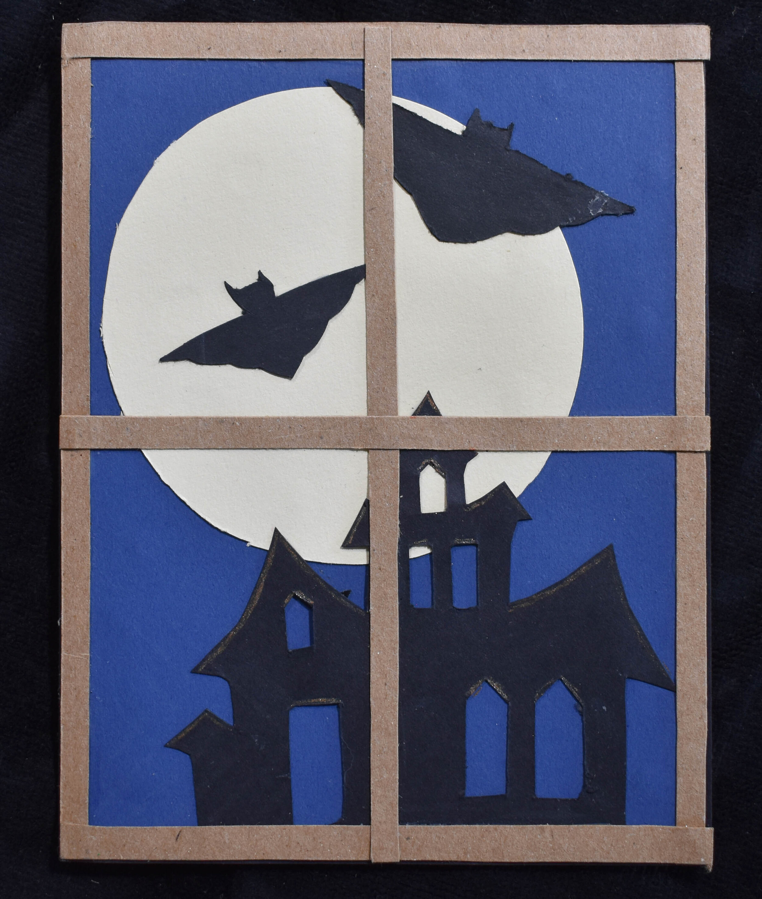
Yes, this is the original, first ever Smith Halloween invitation. I still have it because it’s basically an antique at this point.
Our first Halloween party was before social media was widely used, and we had no budget. I used a precision knife to cut out individual pieces from construction paper to create the design. It was quaint and also very singular in dimension. We continued with flat, extremely hand made designs for a few years until the guest list grew and the method became unsustainable.
As time went on, we started to employ stamps in our designs to speed up the process and add dimension.
There are some skilled makers in the world who create art out of craft store paper, but nothing beats the patina on paper that has been truly aged. Here, we used pages from old, retired library books as a base page for our invitations.
The circus party invitation is another demonstration in texture and stamps. It was also the first year our theme wasn’t generically Halloween. We used a mix of fabric and stickers for layers of character. The stamp also allowed for a rapid insertion of pertinent party information without the machine perfection of a printer to retain the handmade aesthetic.
Envelopes are another chance to add detail. We employed paper candy bags for packaging whimsy and vintage circus poster stamps.
I kept this one because the apostrophe was in the wrong place. :)
A big evolution in style happened the year we moved into Sassafras Farmhouse. We started clearly defining the party themes so we sent out messages in a potion bottle for a witch gathering. The exterior of the bottle was decoupaged with cheesecloth scraps to make it look aged. The inside contained a bit of moss, bugs, and an eyeball along with a rolled up scroll containing party information. Removing the wax seal proved to be a puzzle for guests too.
The downside of this approach is the expense. To cut back on shipping costs, we hand delivered these to doorsteps and even accidentally sent someone on a scavenger hunt to find theirs.
The year of the vampire party, we continued with the 3-D invites by creating a vampire fighting kit that included a cross, bundle of “wolfsbane,” and garlic.
In this case, we couldn’t find the quantity of naturally aged paper we needed so we used a mixture of dying with tea and burning the edges of the pages to create the desire finish. The text was all hand-written and included a quote from Dracula to open. Rather than using a blocked formula of date, place, and time, the party details were woven into the letter.


